Modal-PopUp / Responsive
Can be displayed in All Devices
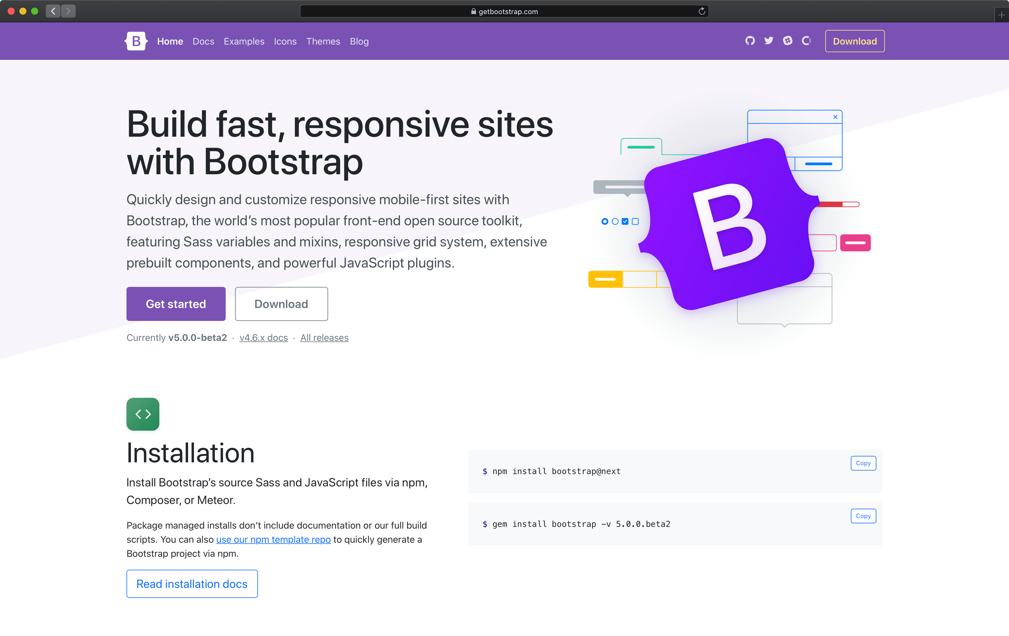
Quickly design and customize responsive mobile-first sites with Bootstrap, the world’s most popular front-end open source toolkit, featuring Sass variables and mixins, responsive grid system, extensive prebuilt components, and powerful JavaScript plugins.

Modal-PopUp / Non-Responsive
Can only be display in desktop application
Quickly design and customize responsive mobile-first sites with Bootstrap, the world’s most popular front-end open source toolkit, featuring Sass variables and mixins, responsive grid system, extensive prebuilt components, and powerful JavaScript plugins.